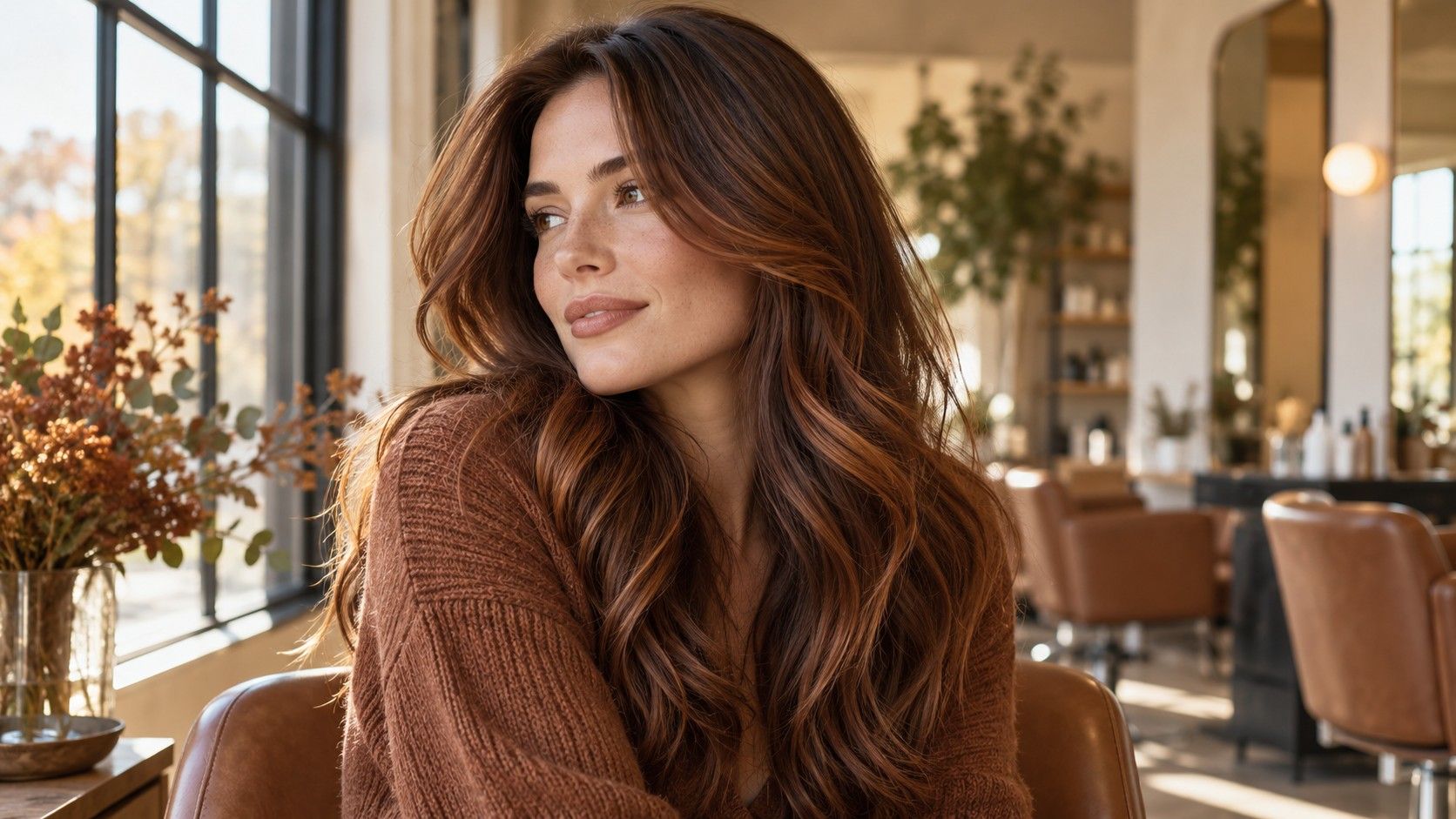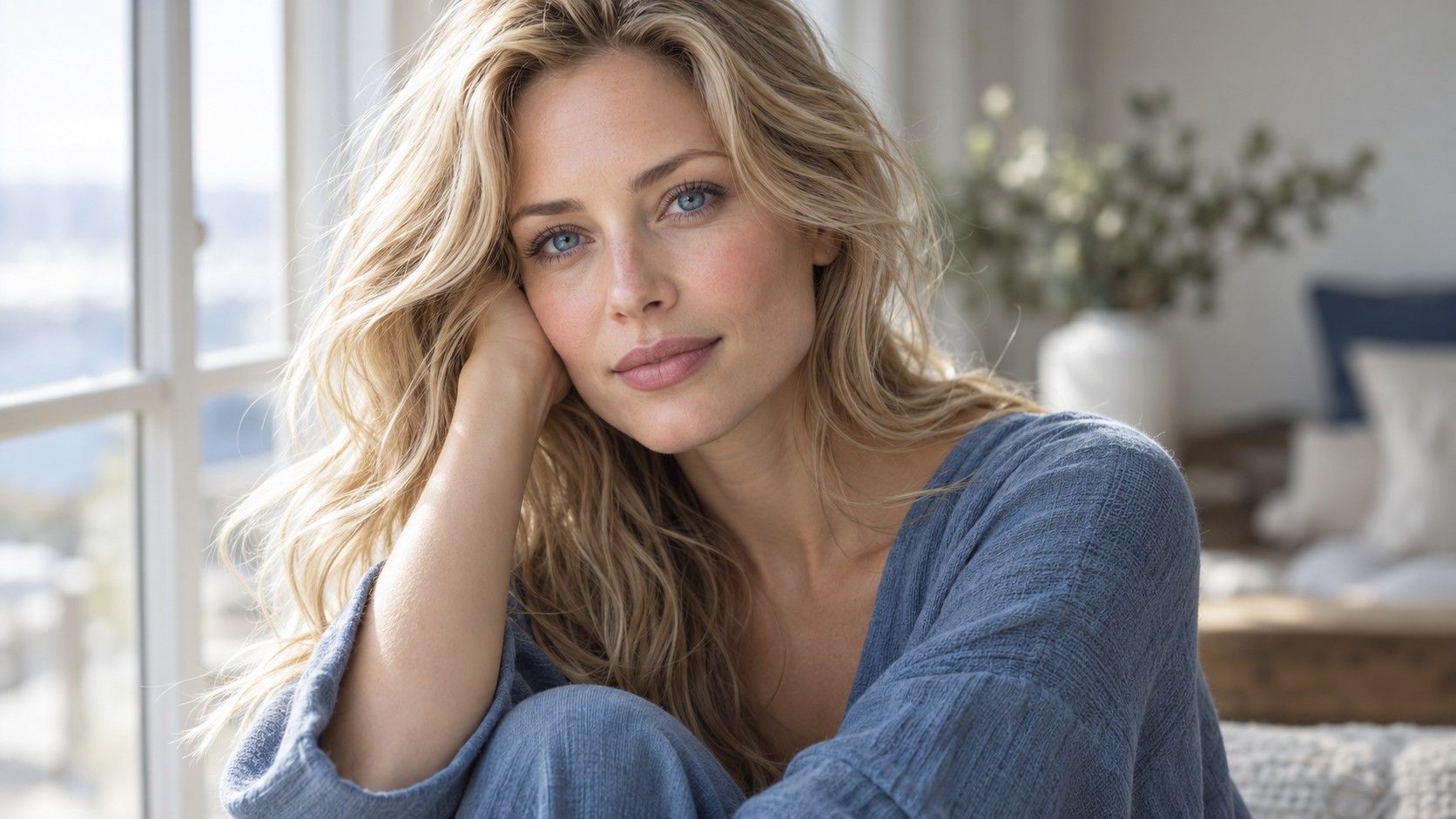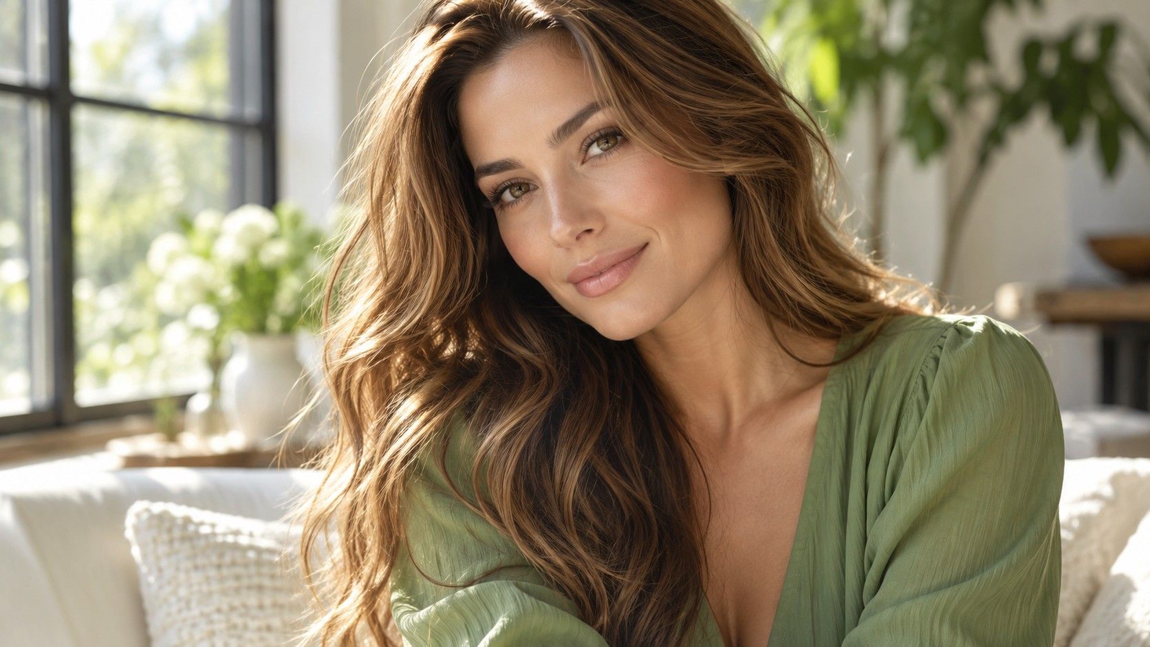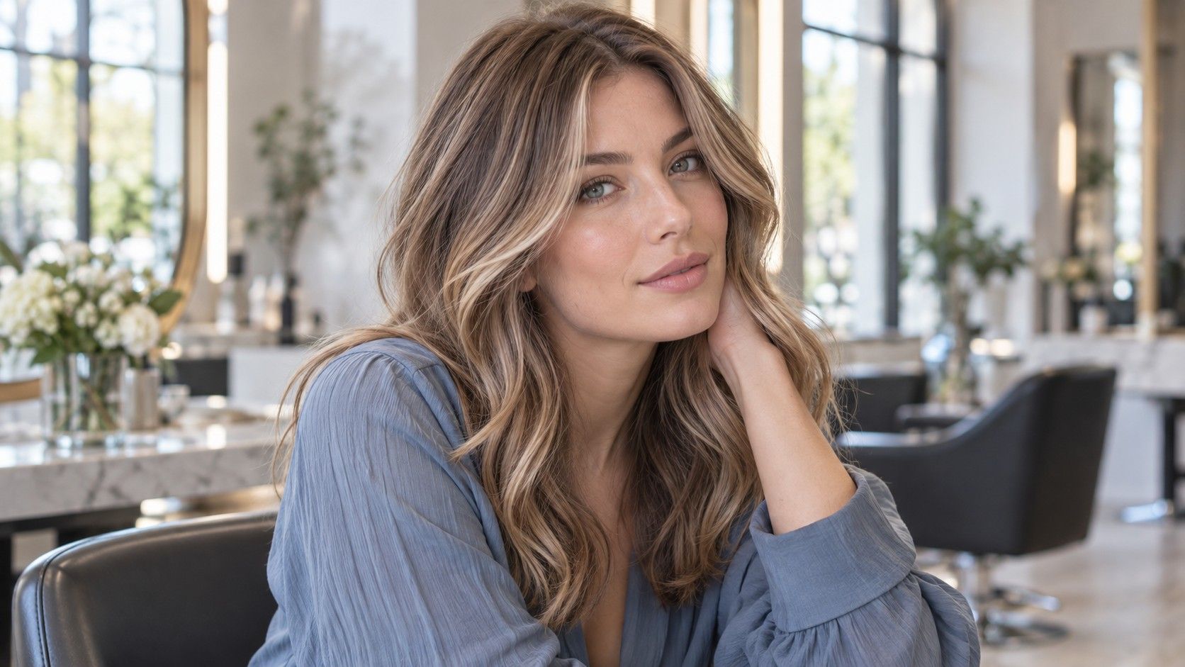
Light, cool and soft summer references can look related while asking for very different changes. Compare their depth, warmth and contrast against your current hair, then decide what you would enjoy maintaining.
Sorting light, cool and soft references
Summer palette hair colors are often grouped under one label, although the saved images can point in different directions. Light summer references tend toward airy, lighter results; cool summer images emphasize restrained warmth; soft summer favors a muted, blended finish. Treat these as visual descriptions, not a test you must pass before making an appointment.
Collect one representative picture for each direction with comparable lighting. A pale beige blonde photographed in sun can look warmer than a darker ash brown photographed indoors. Compare the visible root depth, brightest strand and overall contrast rather than relying on the caption.
If all three appeal to you, decide which property matters most. You might like the lightness of one picture, the quiet tone of another and the easy grow-out of a third. A stylist can discuss a result that combines those preferences without insisting on a rigid category.
You may see the three summer labels used differently across guides. That is one reason to translate the images into ordinary adjectives: lighter, cooler, softer, or more blended. A stylist can work from those visible qualities and your starting hair without settling a debate about the exact seasonal category.
Matching depth before debating shade names
A change of depth is often more noticeable than a small shift from neutral to cool. Hold a current daylight photo next to a target image and compare the hair near the part line. If your own base is medium brown and the target is pale blonde, that is a substantial change regardless of whether both images are described as summer shades.
Look at the lightest part of the target and ask whether it occupies a few fine pieces or most of the head. The answer affects how the color feels in everyday light and how visible the roots will be later.
Shade names are imprecise across salons and photographs. Mushroom, sand and ash may describe similar-looking colors in one image set and quite different colors in another. Point to the parts of the photograph you want: depth at the crown, tone around the face and brightness at the ends.
Take note of what the target does at the ends. An image with bright ends and deeper roots can seem like an all-over blonde at first glance. A close look reveals a much gentler transition at the scalp, and that detail may be the part you actually want to borrow.
What warm highlights change
A few golden pieces can make a cool or muted base appear warmer overall, especially around the face. That may be exactly what you want. It is useful to notice the change rather than assuming any highlight will preserve the same palette effect.
Compare references in indirect daylight. Sunset shots exaggerate amber, while cool studio light can make even neutral blonde look gray. Save an image where the hair, face and background all appear naturally lit so the colorist can read the tone more reliably.
Placement matters. Fine highlights scattered through the top give a different result from two strong front panels. If you have a low-contrast target in mind, ask how the brightest strand will sit against the roots when the hair is tied back.
Warmth can be welcome in small amounts. A strictly gray-looking result may disappoint someone who saved a softly neutral blonde. Point to an example with the amount of warmth you can tolerate, and one that crosses your line into obvious gold or orange. The comparison is more precise than asking for no warmth at all.
Finding an easier grow-out
If you want fewer salon visits, start with options close to your natural depth. A soft transition at the root or subtle dimension through the lengths can shift the look without setting up a sharp line at the part. Compare a polished first-day image with a grown-out reference if you can find one.
Light, cool tones may need attention as their initial finish changes. Ask what the stylist expects to happen between visits and how often the tone would need refreshing for the look you want. The answer depends on your present color and previous processing.
A low-maintenance choice is personal. One person is comfortable with a visible shadow root; another wants the front pieces consistently bright. State what would bother you in the mirror at week six. That is a better planning tool than a generic promise that a shade is easy to maintain.
Budget belongs in the decision alongside time. A result that depends on multiple visits or regular toning has a different ongoing cost from subtle dimension near your existing depth. Ask for a realistic maintenance outline before choosing the most luminous photograph on your board.
Making a useful photo board
Keep the board small: three desired images, one image that is too warm, and one that is too pale or too dark. Add a clear photograph of your current roots and ends. This gives the conversation a starting point and a boundary without burying the colorist in twenty conflicting screenshots.
Use photos that show hair texture similar to yours when possible. A softly blended brunette may look different on straight hair than on curls. Include a face-level view and, if relevant, a tied-back image so placement near the hairline can be discussed.
Before leaving the consultation, summarize the desired depth, amount of warmth, and degree of contrast in ordinary words. Ask how the plan fits your time and budget for upkeep. The right summer reference is the one that helps you make those decisions clearly, even if your final shade does not match a seasonal chart exactly.
Photos are imperfect, so use words to confirm the final plan. Say whether you want the overall impression to stay brown, become blonde, or sit between them. Then agree on how much contrast you want at the face. Those two decisions will still make sense when the reference images are no longer on the screen.