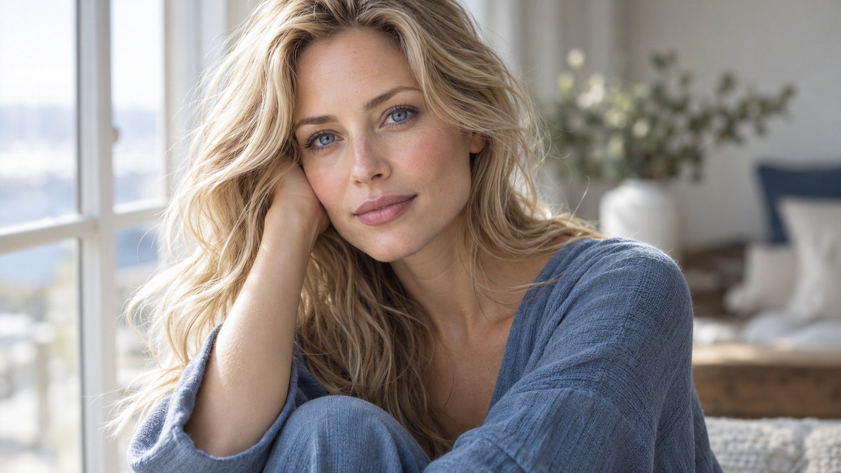
Blonde hair, blue eyes and fair skin describe three visible features, but they do not identify a single set of flattering colors. A practical palette starts with what your blonde looks like in daylight, how much contrast you enjoy and which clothes make your face look clear to you. Compare those pieces together before choosing a seasonal label.
Blue eyes do not settle the undertone question
Two people can have blue eyes and very different skin appearances. One may prefer a warm ivory shirt, another a cool white, and both observations can change under artificial light. Eye color is useful as part of the overall picture, but it cannot diagnose undertone on its own.
If you are searching for a blonde hair blue eyes fair skin color palette, begin with photographs taken near a window. Wear a plain top and hold two fabric colors near the face, such as warm cream and cool white. Keep the camera exposure similar. Look at the skin and shadows first, then notice whether the eyes appear clearer.
Repeat with a muted and a bright color at similar warmth. This separates the question of temperature from the question of intensity. A dusty blue and a vivid cobalt are both blue, yet they create different contrast around pale hair. The palette becomes more useful when you can describe which variable changed.
Is the blonde soft, deep or bright?
Blonde covers a wide span, from dark beige to pale platinum. A fair face framed by dark blonde may hold a stronger navy neckline comfortably; the same face with very light hair may feel different in black. Compare current daylight photos before borrowing a palette from someone with a different blonde depth.
Warmth matters independently. Honey blonde near the cheeks can make camel or warm green feel connected; ash blonde may make those same garments seem separate. These are possibilities to check, not rules. Place the garment directly beneath the hair and look at the whole frame rather than an isolated strand.
If you color your hair, include the natural root in the assessment. A root shadow can add enough depth that an outfit with higher contrast still feels balanced. The tone of the lengths and the darkness at the crown can pull in different directions, so one adjective for the hair is often insufficient.
Build clothing colors around the hair you wear now
Choose a small test group from your own wardrobe: one light neutral, one dark neutral and two colors you often reach for. Photograph each in the same place. A blouse that looks wonderful on a hanger might wash out next to pale hair, while a darker neckline may bring useful definition.
Compare colors at the face, not only in full-length outfit pictures. Scarves, collars and earrings influence the immediate frame; trousers do much less. If a bright blue top feels too intense, try a softer blue or keep the bright shade farther from the face. You do not need to discard an entire color family.
Use makeup and glasses consistently during the comparison. Dark frames can supply contrast that light hair does not, and a strong lip can change how a pale top reads. The goal is a palette for your actual routine, including the items you wear most days.
Test contrast with honest photographs
For a quick check, place a pale top and a dark top beside your face on separate photos. Step back to thumbnail size. Does the dark color sharpen the features or become the main event? Does the light color feel calm or make the face disappear? The answer is about the complete image, not the category printed on a color chart.
Use indirect daylight and turn off aggressive phone filters. Bright sun can bleach both hair and skin in a photo, making every shade seem softer. Indoor yellow light can make a cool blonde look warm. Repeat the comparison on another day if the two sets disagree.
If you are planning new highlights, photograph the current wardrobe test first. Hair color may change the preferred balance of clothing. That is a reason to update the palette after the salon visit, not to choose a hair shade solely to fit one seasonal chart.
Avoid a single formula for three features
A friend with the same hair, eye and skin labels may prefer a different level of contrast, wear a different blonde and live under different light. Treat online palette images as candidates. Select a few colors to test rather than buying a full wardrobe on the strength of one label.
Write down specific observations: cool white made the eyes clearer but emphasized redness; soft navy felt more balanced than black; peach looked better with the current golden highlights. Such notes are more actionable than simply writing Summer or Spring.
If you change the hair, revisit those notes. Roots grow, toner shifts and clothing stays. A flexible palette gives you dependable neutrals and room for the colors you simply enjoy wearing. Personal preference belongs in the decision, even when an image chart suggests otherwise.
Make a small palette you can actually use
Select two neutrals you wear often, two colors that reliably lift your face and one experimental shade. Photograph them as real garments near the face. This is enough to guide a purchase or a salon discussion without turning your wardrobe into a strict set of approved chips.
Separate colors used in large areas from small accents. A vivid cobalt scarf can give a pale outfit structure even if a full cobalt coat feels overwhelming. Conversely, a soft beige that works as trousers may vanish beside the face when worn as a high collar. Placement matters as much as the color name.
Keep notes after a normal day rather than relying only on a five-minute mirror test. Ask whether the color still felt comfortable outdoors, on a video call and under indoor lights. A shade you enjoy wearing repeatedly deserves a place even if a seasonal graphic omits it.
When the blonde changes, compare the same garments again before buying replacements. New highlights may alter the balance, but often a different neckline, deeper accessory or changed lip color is enough. A useful palette adapts to the person rather than demanding a new wardrobe whenever hair is toned.