A muted shade can look appealing on a screen and surprisingly different beside your natural roots. This guide compares beige blonde, mushroom brown and soft auburn as practical color choices, with daylight, dimension and upkeep in view.
When beige blonde looks balanced
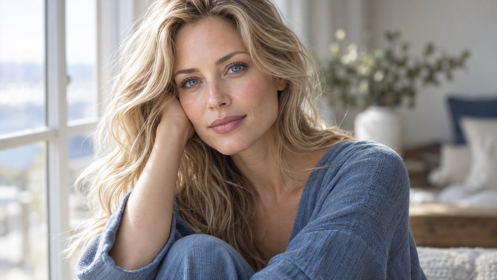
Beige blonde sits in an awkward but useful middle ground. In a soft summer hair color palette, the goal is a subdued finish rather than a bright yellow blonde or a steel-gray one. Bring a daylight image of the shade you like to a consultation, then ask how it would look beside your own roots. A light beige swatch shown on white paper can appear gentle; against dark natural hair, the same swatch may read much brighter.
If you already have a medium blonde base, a few softly blended lighter pieces may be enough to change the overall impression. If your base is brown, reaching an all-over pale blonde is a larger change with a more visible grow-out line. That difference matters more than whether a salon calls the target color sand, oatmeal, or beige.
Look at the front hairline as well as the ends. A face-framing piece that is several steps lighter can create a strong stripe in photos, even when the rest of the color is quiet. Ask to compare a fine veil of brightness with a broader ribbon before committing to placement.
If a beige reference looks almost cream on your phone, lower the screen brightness and look again in daylight. Screens can make the lightest strands seem gentler than they would beside a natural brown root. Describe the maximum brightness you are comfortable seeing around your face, not just the overall color of the picture.
When mushroom brown is the safer shortlist
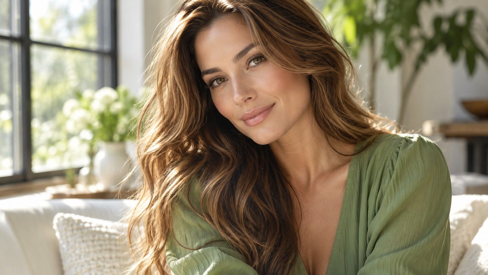
Mushroom brown often sounds gray in a written description, yet good references usually show a brown base with restrained warmth and visible dimension. Put two or three photos beside one another: one in shade, one in indirect daylight, and one close to your natural depth. If all the references look nearly charcoal, they may be too cool for the soft result you had in mind.
This option can be practical when natural roots are medium brown. A soft transition near the part line gives the new shade room to grow without an abrupt border. On naturally lighter hair, the same brown may feel like a major darkening; ask whether a partial lowlight approach would answer the desire for depth first.
Color photographs are useful for direction, not a promise. Camera white balance can turn a neutral brown greenish or violet. Describe what you want to avoid in plain terms, such as orange bands or a flat gray finish, and let the colorist translate that into a workable plan for your starting hair.
For a mushroom-brown shortlist, choose photographs that still show brown in the midlengths. The word mushroom has been attached to gray, taupe and even greenish edits online. You can ask for a cool-leaning brown without asking your stylist to reproduce the color cast of a filtered image.
If soft auburn keeps catching your eye
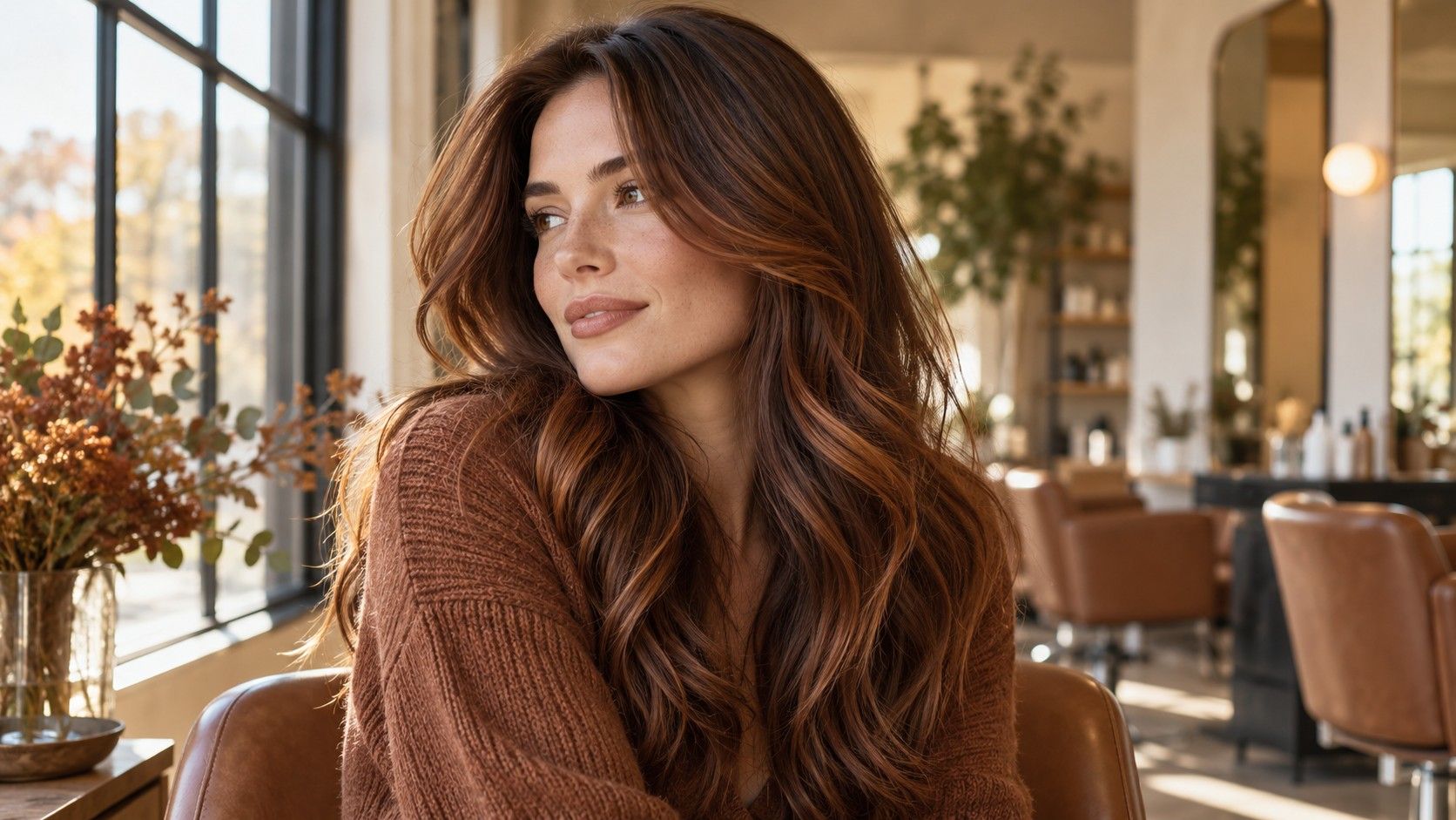
A subdued auburn is an option for someone who likes a little copper but does not want bright orange hair. Compare a muted rose-brown, a cinnamon brown, and a more obvious copper side by side. Their depth may be similar, while the amount of visible red changes the whole feel. This is a preference decision; a seasonal label cannot decide it for you.
Natural hair and previously colored lengths can take a warm result differently. Bring a current daylight photo of both roots and ends, especially if your ends have been lightened. Ask for a realistic description of how the chosen warmth will look after several washes and how often it may need refreshing.
A small warm panel near the face has a different effect from an all-over auburn. If you are unsure, discuss a restrained change that leaves the dominant hair color close to your own. That makes the first appointment a useful comparison rather than a dramatic test of an abstract palette.
Warmth is especially personal at the hairline. A soft auburn that looks subtle from behind can become the main feature when you pull your hair back. Compare a front view and a profile view of each reference, then decide whether a warmer frame is desirable or whether the red should stay mainly through the lengths.
Keeping dimension quiet instead of flat
Muted does not have to mean one solid block of color. Thin highlights, lowlights close to the base, or a soft gloss can make texture visible without creating a high-contrast pattern. Check the widest light and dark pieces in your references. If you can count broad stripes from across the room, the image may be more contrast than you intended.
At the salon mirror, look at the part line and the hair beside your cheeks. These areas dominate a face-level photo. A muted overall shade can still feel sharp if a bright piece starts exactly at the root. Ask where the lighter pieces will begin and how the root transition will look a month later.
The same color can seem deeper on straight, smooth hair and lighter on curls that separate into small strands. Use photos with a texture close to yours when possible. If you regularly wear your hair tied back, include a reference that shows the hairline rather than relying only on loose-hair images.
Your cut also controls how dimension appears. Layers expose several tones at once, while a blunt edge can show the lightest section as a distinct band. Ask how the placement will read when your hair is worn in its usual shape, and whether the same design works when the part shifts slightly.
A short reference list for the appointment
Take three images: a shade you like, a depth you like, and an example that goes too warm or too gray. Add a daylight photo of your present hair with roots visible. These references give the colorist a useful boundary, while a single filtered photograph leaves too much open to interpretation.
Ask which part of the proposed result comes from lightening, which from adding depth, and which from a temporary tone. The answer affects appointments and upkeep. You do not need a technical formula, but you should know whether the look depends on regular toning and how the grow-out will appear.
Finally, judge the result in ordinary light as well as under salon lamps. If it seems different on the street, wait to compare a few daylight photos before deciding that the color has shifted. A soft summer palette is a working visual direction, not a rule that overrides what you enjoy seeing in the mirror.
Leave with a simple record of the agreed direction. A note such as medium brown depth, muted warmth, and no bright front stripe is more useful at the next visit than a single shade name. It also gives you a fair standard for judging the result when the initial salon styling has worn off.