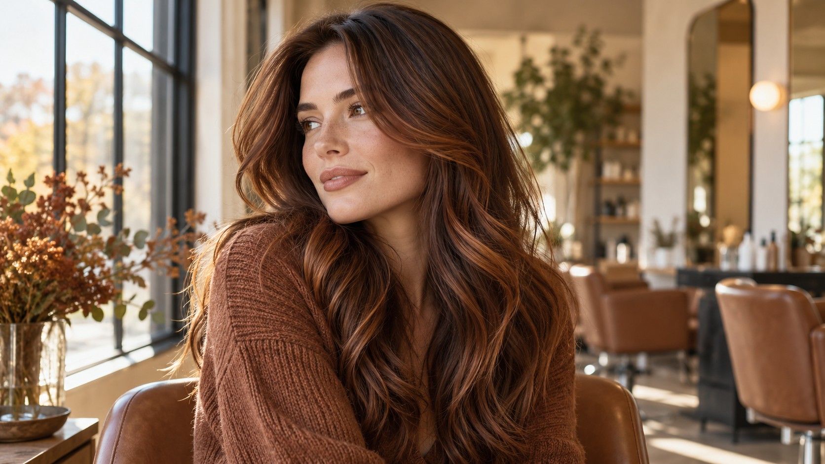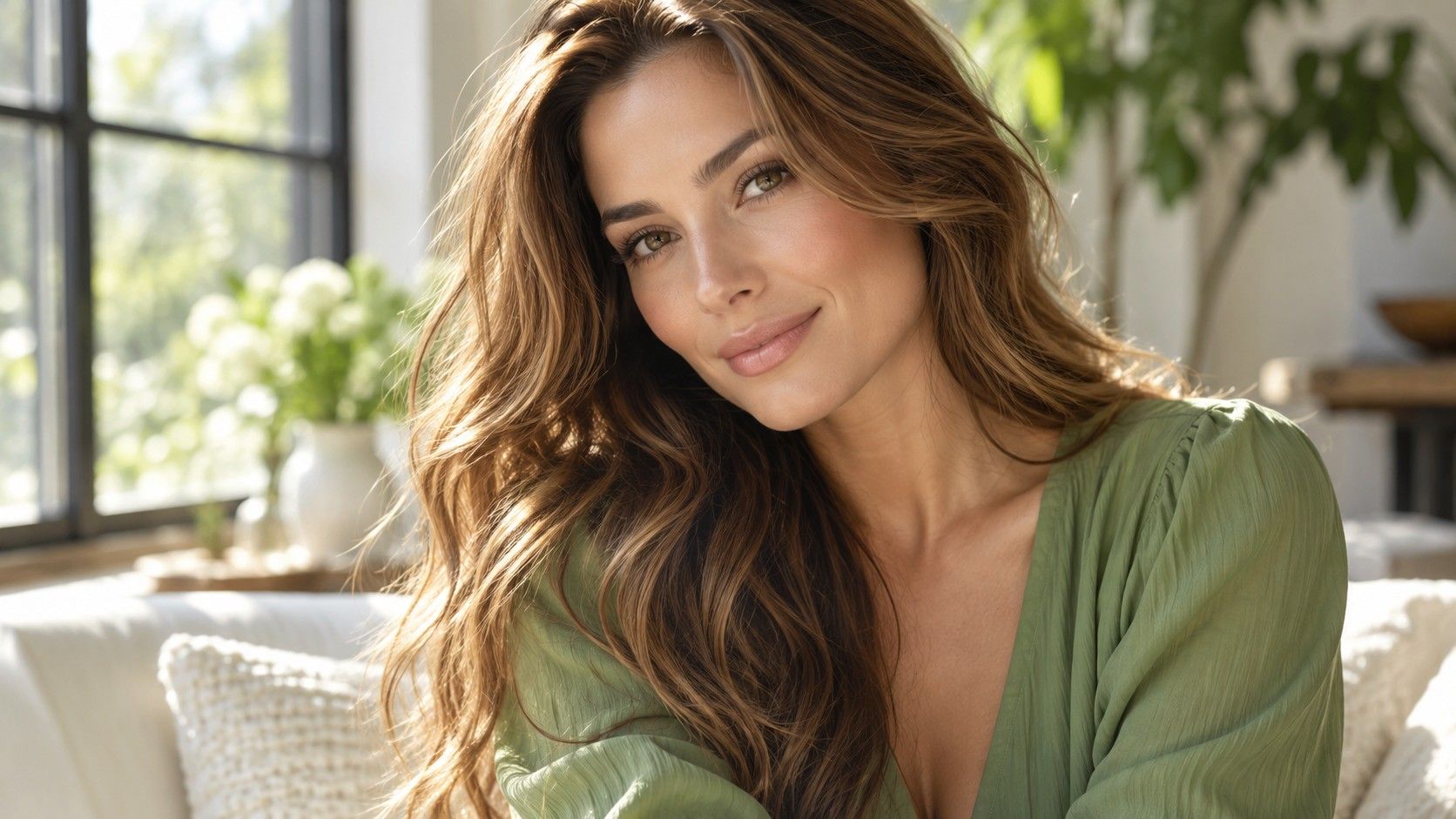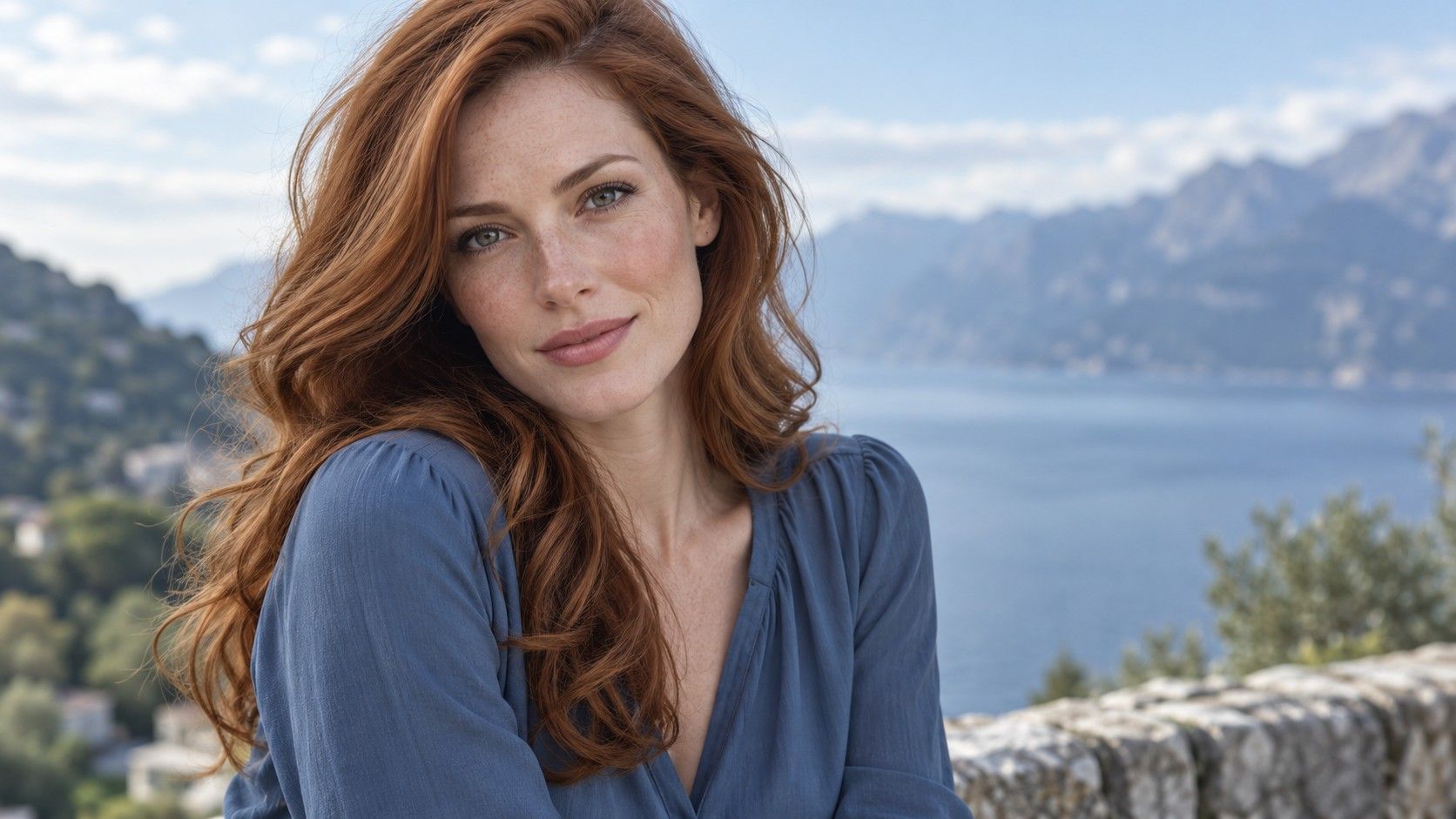
Red hair can be quiet or vivid. If you like a Summer palette but want a change from brown or blonde, compare muted auburn with bright copper at the same depth. The amount of red near the face, the starting color and the way the shade fades will matter more than the seasonal name on a photograph.
Muted auburn or bright copper in daylight?
Auburn is an elastic label: one reference may show cool brown with a red cast, another a nearly orange copper. Put two examples side by side at similar depth and ask which one still looks appealing when the styling and makeup are removed. A close crop of glossy hair often hides how strong the red appears next to a face.
For red hair for a summer palette, a muted auburn is often the quieter starting comparison. It can give brown hair a soft red shift without making bright copper the first thing seen. That does not mean copper is forbidden. It means you should decide whether you want the hair to lead the whole look or sit within it.
Check both examples in indirect daylight. Copper can appear warm and vivid beside a blue shirt; a brown-based auburn may read almost brunette indoors. Ask for a reference photograph where the full head and roots are visible so the stylist can see the actual balance of red and brown.
How much depth should remain?
A deep auburn and a pale strawberry tone communicate very different changes, even when both are described as soft red. Compare them against the depth of your natural hair. If you start with medium brown, red that stays near that level may feel familiar. A much lighter result also changes contrast around the brows.
Place a swatch by the cheek and then step back from the mirror. At close range you notice individual red strands; at normal conversation distance you see the overall shape of light and dark. That second view is useful when deciding whether the color dominates your clothing or frames your face.
Long layers can hold lighter pieces at the ends while keeping a darker crown. A shorter cut places the color nearer the face throughout. Show the stylist your current cut and where you part it. The same auburn photograph may need a different placement to make sense on your head.
Why the same red changes between photos
Red is particularly vulnerable to lighting tricks. Warm bulbs amplify orange, while a cool phone screen can mute it. A salon image taken beneath ring lights tells you little about how the shade looks outside. Compare unfiltered photographs in window light and in the indoor setting where you spend most days.
Keep the same shirt and similar makeup when comparing candidate swatches. A coral lipstick can push a quiet auburn toward copper in the overall picture; a gray neckline may make a bright red seem even stronger. These are viewing conditions, not proof that a particular person belongs to one season.
Ask to see references after a few washes if the stylist has suitable examples. A fresh gloss and a lived-in shade are both relevant. Record which version you actually prefer so the consultation is about the color you expect to wear for weeks, not one appointment-day frame.
What does red fading mean for your plan?
Red tones can appear to shift as the finish wears, and the visible change depends on the starting hair, previous color and selected formula. Ask your stylist what they expect on your particular hair. A red that gradually looks more brown is a different maintenance experience from a bright copper that you want to keep vivid.
Look at the root line too. Natural brown growing into muted auburn may be less obvious to your eye than dark roots under a much lighter strawberry shade. If you prefer spaced appointments, mention the longest interval you can comfortably manage. Placement and depth can then be chosen with that real interval in mind.
Take a daylight photograph when you like the color and another at the point when it feels tired. At the next visit, describe whether the problem was lost red, unwanted warmth or a sharp root line. Asking to make it red again leaves too much open to interpretation.
Use a consultation to narrow the red
Bring three references: one close to the goal, one too copper and one too dark. This gives the stylist useful boundaries. Show the natural root and any previously colored ends, because those parts may respond differently to the same plan. A strand discussion may be appropriate when the history is complicated.
Ask what can realistically be achieved in the first appointment and how an intermediate result may look. Avoid treating a photograph as a guaranteed formula. Hair condition and earlier color influence the route, so a competent answer may be a staged plan or a different depth.
Choose the shade after seeing it beside your face, clothes and brows. Summer is a visual reference, not a verdict produced from hair or eye color alone. A softer red is useful only if you still like it in your own daylight and can live with its upkeep.
Compare the color with your actual wardrobe
Red hair changes how familiar clothes read. A burgundy sweater that once blended into brown hair may compete with copper, while a muted blue shirt can make red appear stronger. Hold your usual tops under the chin with a candidate swatch instead of testing the color against a blank wall.
If you wear a lot of cool grays and soft blues, a brown-based auburn may feel easier to combine than a bright orange copper. That is a wardrobe observation, not a rule. Someone who enjoys a deliberate clash may prefer the brighter result. The practical question is whether you want to think about that contrast each morning.
Check a red candidate with your typical makeup and without it. A photo taken with a strong lip can balance vivid hair differently from a bare-faced weekday. Keep the two impressions separate when you choose the final depth and placement.
Start a small folder of photographs you still like after a week. Delete references that appeal only because of a haircut or beautiful lighting. The remaining examples should show the shade in conditions close to your own life, making the stylist conversation shorter and more precise.